top of page

Topics
About the Project
Cloudup (name changed) is a system integrator for IT solutions that brings together cutting-edge technologies, deep domain expertise, and leadership that supports business and technology leaders to build customer-centric growth strategies.
The business needed a website redesign to showcase its growing capabilities better and improve findability to drive conversions.
Role
Tools
Duration
Lead UX UI Designer
Figma, Adobe Creative Suite
14 Weeks
UX Research | Wireframing | UI Design | User Testing
Topics
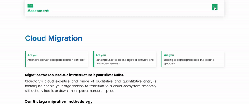
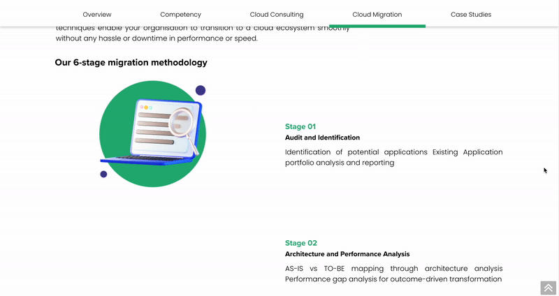
Solution offered
Designed new landing pages with streamlined content and visuals to attract clients and boost user engagement.
Revamped the UI with a vibrant design system, clear layouts, and icons, ensuring full responsiveness across devices.
Optimized content, integrated popular keywords, and added meta tags in collaboration with the SEO Analyst, driving significant traffic growth.
Outcome
Enhanced visibility and SEO, securing top SERP 1,2,3 positions with content consisting right key words and meta tags.


1/2

1/1
Increased traffic with added landing pages, page views, and average session duration, with a reduced bounce rate.
Significant increase in conversions through enhanced CTA taps.

1/1
Client satisfaction and appreciation.
Timeline
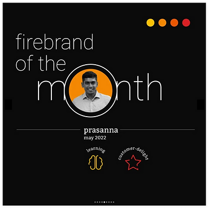
May 2022
June 2022
July 2022
Aug 2022
Stakeholder Interview
User Research
Development
Design
Ideation
Topics
Scoping
Analyzed the existing website and conducted a comprehensive UX audit and content analysis, revealing key issues:
-
Outdated information, missing new services
-
Text-heavy layouts with basic stock imagery
-
Difficult navigation, lacking icons and infographics
-
Muted color palette, non-responsive design.
Interviewed stakeholders and SMEs to gather insights on business objectives and the target audience.
Analyzed user behavior and engagement metrics with Google Analytics, identifying poor search visibility, low conversion rates, and high bounce rates as key challenges.
Collaborated with the Senior SEO Analyst to audit on-site and off-site factors, uncovering the absence of high-ranking keywords and meta tags.
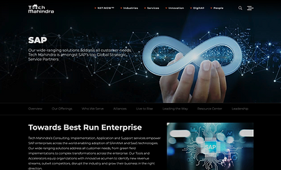
Competitor Analysis
A Competitor Analysis was performed on Tech Mahindra, due to its similar offerings as recommended by the client. Other global companies were also considered.

Proposed New Information Architecture
Existing

The existing information architecture lacked dedicated service pages and meta tags. The basic navigation negatively impacted SEO and findability.
Proposed new IA with additional web page

The redesign introduced dedicated service pages, allowing for more landing pages and enhancing both SEO and user navigation.
Research showed that combining services into "Expertise Pages" matched popular SEO keywords, making them ideal content for new landing pages.
The revamped structure underwent multiple iterations with tree testing involving stakeholders, ensuring intuitive navigation pathways that met client expectations and user needs.
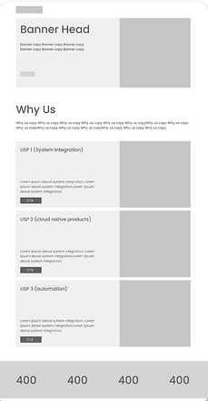
Wireframing
Low-fidelity paper sketches were transformed into annotated digital wireframes on Figma to present to stakeholders.
Their feedback was recorded for iteration until approval.

Creating the UI Style Guide
Embracing the opportunity to completely revamp the client's design system, I extracted colors from the existing logo and added new ones to create a cohesive UI style guide that aligns with their branding.
#0973BA
#24B279
#453B91

#C6E8FF
Type
Proxima Nova Bold
Poppins Medium
Poppins Regular
Buttons
Normal State
Normal State
Hover State
Selected State
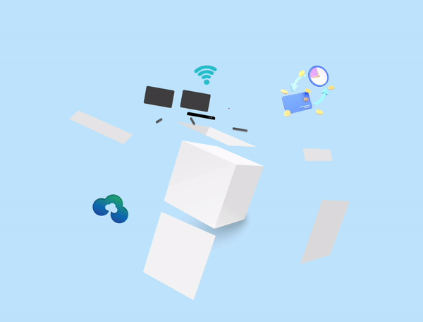
I created customized illustrations and digital assets using Figma and Adobe suite


.png)

The initial website UI draft showcased a dark mode inspired by provided references.
While the client appreciated it, they later requested a brighter design to better reflect their company culture.
Final User Interface Design
.png)
Home
Banner
The banner highlighted the company's key capabilities and USP with strong visuals and compelling copy.
Showcased company expertise with dedicated pages detailing service combinations, supported by case studies of successful projects.

Interlinked pages to offer a clear understanding of each service's role and impact.
A section showcasing the team’s diverse skills and expertise, linked to the About page for deeper exploration
Enhanced with custom visuals, The list of services linked to dedicated pages featuring sticky secondary navigation for improved accessibility and engagement.


1/5
Data-driven insights showcased quantitative statistics to highlight the effects and value of offerings, enhancing trust and appeal.
Insisted the client to collect testimonials, success stories, and positive reviews from satisfied customers to enhance the website's credibility.
Cloudup solution
Gathered Content from the pitch deck while streamlining it to align with goals, showcasing new services and client interactions.

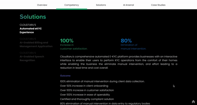
Audited pitch deck data was converted into animated infographics with micro-interactions, improving clarity and engagement.
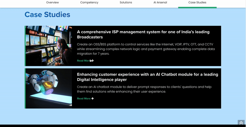
Case studies were curated from the company’s expanded portfolio and integrated into relevant sections to emphasize real-world impact.
The website features a responsive design optimized for all screen sizes, ensuring seamless accessibility across mobile devices and tablets for a global audience.

Learnings
Understanding the business context is essential but was the most challenging aspect of the project.
Simple statements and graphics helped in effectively communicated complex ideas.
Documenting the process is crucial. Missing snapshots of the site prior redesign would have been a good element of this case study.
bottom of page